Control Charts
| Site: | Clare-Gladwin RESD |
| Course: | Michigan Algebra II KHauck |
| Book: | Control Charts |
| Printed by: | Guest user |
| Date: | Tuesday, March 24, 2026, 11:18 PM |
Description
Control Charts
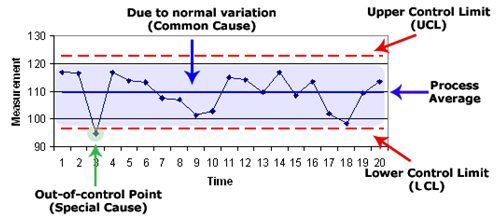
A Control Chart is a graph that is very popular in business and industry. These graphs are used to control variation in product production. Another use of control charts is to determine whether a quality improvement project should aim to prevent specific problems or to make fundamental changes to the process.
A control chart is a graph used to study how a process changes over time. Data are plotted in time order. A control chart has a central line for the average, an upper line for the upper control limit, and a lower line for the lower control limit. These lines are determined by adding and subtracting the standard deviation (?) to the center. By comparing current data to these lines, you can draw conclusions about whether the process variation is consistent or unpredictable. If the process is consistent, it is called in control. If the process is unpredictable, it is considered out of control and is affected by special causes of variation. Control charts are an easy method to check the centering of the distribution and the range, or width of the distribution. If your data represents target practice; the center, or average is where the shots are clustering, and the range is how tightly they cluster.
Basic Procedure
In order to make a control chart, follow the procedure below:
- Collect your data.
- Plot the center or mean; it is usually the target value for the data set.
- Plot the upper and lower control limits usually the mean plus/minus three times the standard deviation.
- Plot data points collected.
- Look for "out-of-control signals" on the control chart. When one is identified, mark it on the chart and investigate the cause.

Out-of-Control
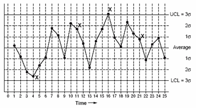
Using the control chart below, the following situations represent out-of-control signals and should be investigated:
- A single point outside the control limits, such as point sixteen is above the upper control limit (UCL).
- Two out of three successive points are on the same side of the centerline and further than 2 standard deviations from it; point 4 sends that signal.
- Four out of five successive points are on the same side of the centerline and further than 1 standard deviation from it; point 11 sends that signal.
- A run of eight in a row are on the same side of the centerline, or 10 out of 11, 12 out of 14 or 16 out of 20. Point 21 is the eighth point in a row above the centerline.
- Obvious consistent or persistent patterns that suggest something unusual about your data and your process.

Video Lesson
To learn how to make a control chart using Microsoft Excel, select the following link:
Control Chart Using Microsoft Excel
Guided Practice
To solidify your understanding of interpreting distributions, visit the following link to StatTrek.com. It provides examples, tutorials, and interactive practice with answers available. You can move easily from one lesson to the next and skip lessons that you do not need to review.
Practice
*Note: If Google Docs displays, "Sorry, we were unable to retrieve the document for viewing," refresh your browser.
Answer Key
*Note: If Google Docs displays, "Sorry, we were unable to retrieve the document for viewing," refresh your browser.
Sources
Sources used in this book:Arthur, Jay. "Control Chart Video."
Embracing Mathematics, Assessment & Technology in High Schools; a Michigan Mathematics & Science Partnership Grant Project
Six Sigma Center for Excellence, "Control Chart Image.""Statistics Tutorial: Variables."
Tague, Nancy R. The Quality Toolbox. Second ed. ASQ Quality Press, 2004.