Plotting Data
| Site: | Clare-Gladwin RESD |
| Course: | Michigan Algebra I |
| Book: | Plotting Data |
| Printed by: | Guest user |
| Date: | Wednesday, March 18, 2026, 10:36 AM |
Description
Plotting Data
Introduction
Making a graph is one way to look at and organize data. In this section, the type of graph used is a scatter plot. The purpose of a scatter plot is to look at the relationship between the two variables and determine if there are any problems with the data. It is also useful to determine if the scatter plot indicates anything unique or interesting about the data, such as:- How is the data dispersed?
- Are there outliers?
- What's the direction of the data?
- Is there a pattern? Linear or a curve?
- How strong is the relationship between the 2 variables, if any?
- In this section you will learn to make a scatter plot, distinguish key ideas and describe the data in scatter plots.
Graphing
A scatter plot is one way to display data. The plot gives a good visual picture of how two variables might be related. In a scatter plot, ordered pairs are plotted in a coordinate plane but not joined. The resulting pattern indicates the type and strength of the relationship between the two variables. The following plots demonstrate the appearance of positively associated, negatively associated, and non-associated variables respectively:
As with any graph, there are some general rules to follow. Be sure to use a ruler, label the axes including appropriate scales and units, and title the graph. Now plot the data points. Each ordered pair is an (x , y) value. The independent variable (x) will be placed on the horizontal axis while the dependent variable (y) goes on the vertical axis. The dependent variable changes or "depends" on the value of the independent variable.
Example
Below is an example of a scatterplot: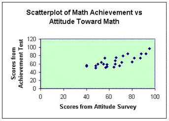
Each data point in this case represents an individual's score on an attitude toward mathematics survey and their score on a mathematics achievement test. For example, two students scored 46 on the attitude survey and their scores on the math test were 54 and 56. The student who scored 80 on the attitude survey had a 65 on the achievement test. Each point on the scatterplot represents a "pair" of scores.
Making a Scatterplot
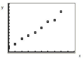
Plot the following points to make a scatterplot:{(0, 3), (1, 5), (2, 8), (3, 10), (4, 12), (5, 15), (6, 19), (7,20), (8, 25)}
The result is the following graph:
Scatterplot
Using a TI Calculator
For help with using a TI 83/84 calculator to graph scatter plots, select the following link:Graphing Calculators
Interactive Activity
To access an interactive scatterplot, select the following link:Scatter Plot Interactive
Describing Distribution
Once the data has been graphed, look at the graph to see patterns of the data. The pattern tells us quite a bit about data. There are some key words used to describe the distribution or pattern of the data. Not all the words are used to describe data for every kind of graph but it is good to remember them.The first has to do with the shape. Is the data symmetric (a mirror image)? Or is the data stretched to one end or the other? In a scatterplot, does the data appear to be linear or does the distribution look curved?
Some questions to consider when looking at a scatter plot include: are there any outliers or data that is removed from the rest of the data, what is the spread of the data, what are the smallest (minimum) and largest (maximum) data points, and finally what is the range of the data? To find the range, subtract the minimum from the maximum point.
Example
Create a scatter plot for the following data and describe the graph: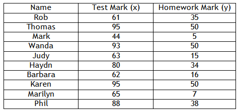
Step 1. Draw a set of axes and label them according to the table. Add an appropriate scale with equal increments.
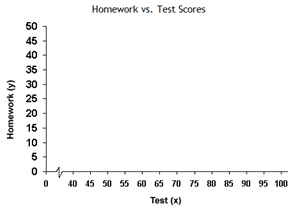
Example Continued
The data is graphed below:
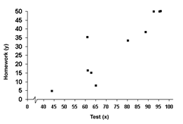
Step 3. Is there a relationship between the two variables?
The points are basically all doing the same thing, so there is a relationship.
Step 4. Is the graph linear or non-linear?
It is basically linear with a couple of points that do not follow the pattern.
Step 5. Is the relationship positive or negative? Is it strong or weak?
As the x-values increase, so do the y-values. Therefore, the graph is positive. Most of the points are in the same line, so it is relatively strong.
Guided Practice
To solidify your understanding of scatterplots, visit the following link to Holt, Rinehart and Winston Homework Help Online. It provides interactive practice with answers available.
For more practice, visit the PBS Teachers Mathline Temperature Activity. The solution for each problem can be found under the answers link at the top of the page
Guided Practice #2
Numb3rs Activity for Teachers
Select the following link for an in-class activity to create scatterplots with solutions and extensions based on the Numb3rs television show:Numb3rs Activity
Online Practice
For online practice on scatter plots, select the following link:Scatterplot Practice
Practice
Plotting Data WorksheetAnswer Key
Plotting Data Answer KeyCorrelation vs. Causation
Correlation and causation are concepts that are often confusing for students. Let's start with definitions. Correlation is a mutual relation between two or more things. Causation is a relationship in which one action or event is the direct consequence of another. This means that one thing causes another. Correlation alone does NOT prove causation. In other words, a relationship between two variables does not mean that one causes the other to occur. There are a number of reasons and ways that two variables can be related without causing one another to happen.Examples
Example 1 Suppose a cup is turned upside down and liquid falls on the floor. There is no other possible reason that the liquid is on the floor other than the cup was turned upside down. Causation has one independent variable (whether or not the cup is upside down) and one dependent variable (whether or not the liquid falls on the floor.) It can be inferred that if there is liquid on the floor, the cup must have been turned upside down.Example 2 Correlation means that two things are related, but not necessarily cause-and-effect. In this case, there are two dependent variables. For instance, temperature vs. number of ice cream trucks on the street. These are a correlation because as temperature increases, so does the number of ice cream trucks. However, there is no causation - the increase in temperature does not cause the number of ice cream trucks to increase. This is because there are two dependent variables. If you said "increasing temperature causes an increase in ice cream trucks" it would also mean that "an increase in ice cream trucks causes an increase in temperature." This is clearly a false statement.
Lurking Variables
Suppose there is a high positive correlation between the number of fire fighters sent to a fire and the amount of damage done. Does this mean that the fire fighters caused the damage? Or is it more likely that the bigger the fire, the more fire fighters were sent and the more damage that is done. In this example, there is another variable - the size of the fire. This other variable is the causal variable, correlating the number of fire fighters sent and the amount of damage done. This other variable is a " lurking variable ;" something that affects the outcome but was not included as one of the two variables or one that you may not have been aware of.Sources
Answers.Yahoo.com, http://answers.yahoo.com/ question/index?qid=20090930154953AA7slTu (accessed 08/24/2010).
Central Virginia Governor's School, "Scatter Plot." http://www.cvgs.k12.va.us/DIGSTATS/Gmain.html (accessed 08/24/2010).
DavidMLane.com, "HyperStat Correlation." http://davidmlane.com/ hyperstat/A62692.html (accessed 08/24/2010).
Education.ti.com, "How Tall is the Criminal?" http://education.ti.com/ educationportal/activityexchange/Activity.do?cid=US&aId=5915 (accessed 09/03/2010).
Embracing Mathematics, Assessment & Technology in High Schools; A Michigan Mathematics & Science Partnership Grant Project
Holt, Rinehart, and Winston, Lesson 4 - 7 Scatterplots. http://go.hrw.com/activities/frameset.html?main=17384.html (accessed 09/03/2010).
MathBits, "Scatter Plots." http://mathbits.com/MathBits/ TISection/statistics1/scatterplot.htm (accessed 08/23/2010
PBS.org, "Weather: Rainfall." http://www.pbs.org/teachers/ mathline/concepts/weather/activity3.shtm (accessed 09/03/2010).
Psychwiki, "What is a Scatter Plot?." http://www.psychwiki.com/ wiki/What_is_a_scatterplot%3F (accessed 08/23/2010).
Shodor, "Scatter Plot." http://www.shodor.org/interactivate/ activities/ScatterPlot/ (accessed 08/23/2010).
TutorVista.com, "Example of Scatter Plots." http://www.tutorvista.com/ math/examples-of-scatterplots (accessed 08/24/2010).
Yale University, "Scatter Plot." http://www.stat.yale.edu/Courses/1997-98/101/scatter.htm (accessed 08/23/2010).